A non-random sample of new PDFs whose titles caught my eye yesterday. Based on a quick scan, so I may have missed something. (These are brand new PDFs - so use even more doubt than for well-published papers.)
-
Mortality rate and estimate of fraction of undiagnosed… cases… Simple amateur model estimates the mortality curve for US March & April diagnoses, using data from worldometers, and a Gaussian[!?] model. March peak death rate is on the 13th day after diagnosis, similar to Chinese data. Total mortality was 21%[!!?] suggesting severe under-testing [or data problems]. Whatever, the same method applied to cases after 1-APR finds 6.4%, suggesting more testing. If the real rate is 2.4% [!?], then 89% of March cases were untested and 63% of April cases. [The 2.4% IFR seems ~4x too high by other estimates. They got it by averaging rates from China, the Diamond Princess, Iceland, and Thailand. It’s not clear if they weighted those. First author cites themselves in a basically unrelated physics paper. But then, I’m not an epidemiologist either.]
-
[Estimation of the true infection fatality rate… in each country] (https://www.medrxiv.org/content/10.1101/2020.05.13.20101071v2?%253fcollection=) Short paper adjusting estimates because low PCR exam rate means exams are restricted to suspicious cases, and vice versa. “Reported IRs [infection rates] in USA using antibody tests were 1.5% in Santa Clara, 4.6% in Los Angeles county, and 13.9% in New York state, and our estimate of TIR [true infection rate] in the whole USA is 5.0%.” Estimates US IFR [infection fatality rate] as 0.6% [95% CI: 0.33 - 1.07], slightly higher than Germany and Japan’s ~0.5%, a bit lower than Sweden 0.7%, and much lower than Italy or the UK around 1.6%. [This is similar to the running Metaculus estimate, and note the 2.4% above is way outside the interval.]
-
Estimation of the infection fatality rate… More “simple methodology” but from claims to be from science & epi faculty in Mexico. They assume all members of a household will be infected together, which is plausible. But they don’t really dig into household data, and don’t really dig into case data, but just explore the method on “available data”. Eh.
-
Reproductive number of COVID-19: A systematic review and meta-analysis…: Global average of R=2.7 [95%CI 2.2-3.3] with lots of variation. They note that’s above WHO but lower than another summary. Among their 27 studies in their analysis, only two [both South Korea], publish estimates <1. Take with salt. By non-epidemiologists. They include Diamond Princess [R>14, albeit with large error bars]. And they claim method [MLE vs SEIR vs MCMC vs…] matters but they have so few samples per category and so many comparisons I don’t think it means anything.
-
Restarting after… Comparing policies and infections in the 16 states of Germany, the UC-Davis authors find that contact restrictions were more effective than border closures. Mobility data comes from Google. Using SEIR models, they then predict the effect of ways to relax policy. They think social distancing (German-style) reduced case counts by about 97% – equivalently, total case count would have been about 38X higher. Contact restrictions were estimated to be about 50% effective, versus about 2% for border closures. [What you’d expect for closing the gate after the Trojan horse is inside.] They put a lot of effort into modeling different parts of the transportation system: cars vs. trucks; public transit. They think that compared to keeping restrictions, lifting contact restrictions will cause a 51% or a 27% increase depending on scenarios. Relaxing initial business closures yields a 29% or 16% increase. Relaxing non-essential closures by 7% or 4%.
-
Relationship between Average Daily Temperature and… (v2). The authors say warmer is better, but note it could be UV or hidden correlation with eg age, pollution, social distancing, etc. And “when no significant differences exist in the average daily temperture of two cities in the same country, there is no significant difference in the average cumulative daily rate of confirmed cases.” Fifteen F-tests, and no obvious correction for multiple tests. I didn’t read in enough detail to know the right correction, but eyeballing the results, I’m guessing that would cut out half their “significant” correlations. Still, it remains plausible .
-
A surprising formula… A mathematician at UNC Chapel Hill claims surprising accuracy using a two-phase differential equations model. (Switches from one curve to the other at point of closest approach.) I haven’t had time to dive into the details, but I’m partial to phase-space for modeling dynamical systems. The paper argues for hard measures, once triggered, a theory the author calls epidemic “momentum managing”, which he expands in a longer linked piece.
-
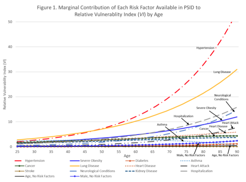
Disparities in Vulnerability… From 6 scholars in population health and aging, at 4 major US universities: “particular attention should be paid to the risk of adverse outcomes in midlife for non-Hispanic blacks, adults with a high school degree or less, and low-income Americans”. So, the usual. Oh, “our estimates likely understate those disparities.” An AI model trained on pre-pandemic medical claims created a vulnerability index for severe respiratory infection, by eduction, income, and race-ethnicity. High school education or less: 2x risk vs. college. Lowest income quartile: 3x risk vs highest. Both because of early onset underlying health conditions, esp. hypertension. See Risk Factor Chart below.